Archives for the month of: March, 2013

130313 (1)

Time condensed and expanded.

When you need to present your best ideas in a coherent and articulate fashion trying to be sure you cover all points without hesitation repetition or deviation you would think 20 minutes would seem an age to fill but in fact it went in a flash. Then you are left wondering how you came across. It was the most glorious sunny day for my interview at the RCA and the board were very welcoming and encouraging as I battled to speak while remembering to breathe. It was all very straightforward. Just talk about my work and why I want to go, what I want to achieve conceptually and technically. Explain the motivation behind my new work, offer some criticism of my work. Nothing tricky but lots more people for them to interview so I just have to wait and see. I feel I have been very honest about myself and am really pleased I was given an interview.

parrallax

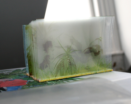
I went along to Cafe Gallery Projects to see what the 2nd year RCA Printmaking students were up to in their public exhibition. Right by the door was a very low table covered in a white cloth, on it was the plaster head of an asian girl . As I entered the draught from the door seemed to cause a reaction, the head moved slightly and I realised it was a live head caked in make-up. Also on the table were bowls of what looked like spices and kecap manis and spoons so the public could ladle condiments over her head. The girl was obviously a contortionist and very good at keeping still for 2 hours, a test of endurance even without sticky sauce and irritant seasonings being trickled over your face. I don’t know if it was the artist herself or not but it was a captivating spectacle, disturbing and questioning complicity. I was rather anxious looking at the show in case I found myself next to a tutor and in another interview situation so I navigated the space quite quickly. I didn’t make a note of any names of the students but I will be interested to see how their work develops before the upcoming end of year show. My favourite piece was a video showing two rectangular receptacles cast in concrete filled with dry ice, light was projected onto the sides and there was some kind of mini explosion within. The concrete looked translucent as the mist bubbled over the sides like some mystical ancient relic. It was beautiful like an Ori Gersht film is beautiful. Some work I found perplexing – not sure whether to blame my own shortcomings or just accept there is art like people that I just don’t get.

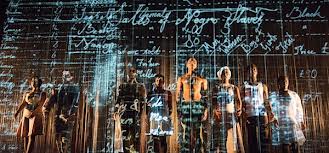
The latest piece of promenade  theatre from dreamthinkspeak ‘In the beginning was the end’ at Somerset House was also perplexing.

dreamspeakthink

Left to negotiate endless corridors and rooms filled with unexplained scientific equipment, being corralled into demonstration areas for new technologies by a variety of ‘men in white coats’ non of which spoke english the audience looked hard for clues to a narrative.

dreamthinkspeak-in-the-beginning

If it had been billed as an art installation maybe expectations would have been different. The rudimentary enactment of corporate failure felt weak for the huge effort put into the infrastructure and the setting which was astonishing for its scale and vision. It wasn’t until the exit that you were provided with an explanation if you needed one of what you had experienced.

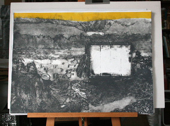
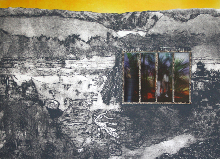
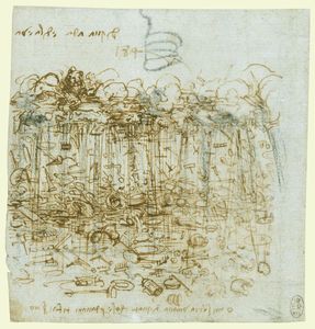
Looking back to Leonardo Da Vinci’s drawing ‘ A Cloudburst of Material Possessions’ dreamthinkspeak take his concerns for humanity obsessed with the material world and fast forward to a future of economic collapse.

Leonardo Da Vinci

Finally on leaving the constructed sets a moment of true wonder, looking up into a maze of architectural delights, arches and stairways that lead back to the courtyard of Somerset House. Diagon Alley was mentioned.

somerset house

Must plan to go on one of their free guided tours at some point.

Dale Devereux Barker came to speak at Ochre Print Studio.

dale-dev-barker

It was interesting to hear about his large scale installation projects involving turning his small lino cut imagery into large enamel sheets. I liked his attitude to printmaking – if you don’t know what the rules are you’re not afraid to break them. I also agreed with him that being faced with walls of framed works behind glass such as at the Mall Galleries drains the work and any stamina you might have to view it. In such circumstances how do you make your work captivate an audience.
Artist Giuseppe Penone examines our relationship to nature and for his latest work he has created a twelve metre bronze cast of a tree, with a gold-leaf clad interior.

Guiseppe Penone

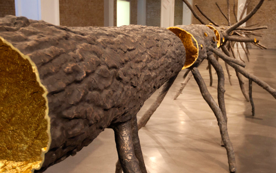
It looks like a giant  insect scuttling across the length of the gallery. It is called ‘Space of Light’ as where the tree was is now a golden void. Looking down the centre of this void is like looking down Alice’s rabbit hole – it looks endless and magical. The tree has been turned inside out – the bark now on the inside, the outside informed with prints of the hands that sculpted it, together it defines the inseparable bond between humankind and nature. To accompany the installation Whitechapel Gallery is hosting talks and events exploring the relationship between nature and the city.

At her talk in the series ‘To Make a Tree’ Finnish artist Eija-Liisa Ahtila explained her interest and difficulties encountered in making a life size portrait of a tree. She comes form a background of painting and filmmaking and her work is very much about the rules of filmmaking but considering the protagonist of a story to be someone or something other than an actor.

Ahtila-Antropomorfa

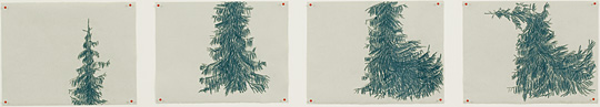
Through drawing she makes her tree a character. She talked of her quest in casting a tree in the role of protagonist. Searching for the perfect tree to fulfill this role. The spruce is so ubiquitous for the Finnish people that in choosing such a common tree to put under the spot light and make a star of her film she echoes the fantasy of the undiscovered talent plucked from obscurity. Her interest is also in thinking about the tree as having a parallel life to the lives of humans and wishing to respect other living things that we share the planet with as equal to ourselves in value. She wanted to experience the tree as a whole – not looking up from below but in its entirety. In the final work we view the tree on its side split across 6 video screens undulating in strong winds with an added soundtrack of birdsong.

Eija-Liisa Ahtila

We are still displaced from the tree by the media but we can contemplate the vast size and the time passing necessary to create this giant.

Wieland Payer whose work I first saw at RCA SHOW 2011 has an exciting solo exhibition at Man & Eve Gallery now, conveniently for me, relocated in the wonderfully eclectic Lower Marsh.

Wieland Payer
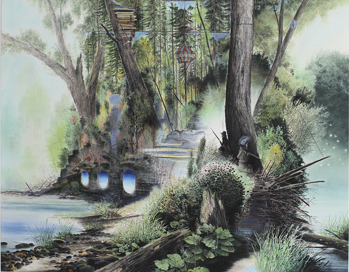
His work seems to span time. The medium of pastels seems fitting for his subject as it has an old fashioned quality which imbues the atmosphere of his work with notions of a bucolic past. It softens the reception of his imagery and adds to the surrealism of the landscapes planted with ambiguous structures which could be futuristic or from abandoned civilizations. There are signs of conflict and a need for refuge amidst the soaring beauty of impossibly tall trees and romantic rocky outcrops.

Wieland Payer 1

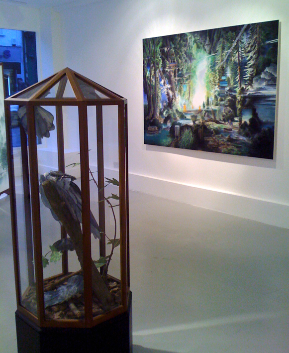
Outsize blue moth sculptures have seemingly emerged from the flat of the drawing and been captured and displayed in a glass cabinet. Their bodies made from paper and coloured with the same pastels as the world from which they came.

I am entranced by his work and the paths it leads me down.

Wieland Payer 2

portfolio

The tension of waiting to hear if my portfolio had managed to gain me an interview at the RCA built as the date when results were supposed to be emailed came and went with nothing happening.

When news finally arrived 5 days late that I did have an interview I felt I had just stepped onto a very high rollercoaster.

Suddenly I was all fingers and thumbs and the new work took on a magnitude it didn’t deserve. I was working on a collagraph of a desolate landscape. Within the landscape would be a glasshouse – a protected environment where things could grow. I had been thinking about conservation and how reliant so many species are on being sited within a protected environment for survival. Building a safe environment. That idea of a haven. My first ideas for inside the glasshouse were of a party amongst tropical plants but I found some photos I liked of children looking like frightened animals about to dash into the undergrowth and hide for safety.

To create the layers inside the glasshouse I had an idea inspired by an old model I had made back at Goldsmiths using OSP transparencies. With just one plant on each layer the image soon disappears into haze. For some reason it always made me think of a prehistoric landscape.

OSP Model

I took the same principle but stacked the images and ran them through the scanner. The light gave a wonderful ethereal effect and I was excited by the number of combinations of layering that could be achieved.

Hot House

I contacted Promptside to organize the transfer of these images onto sublimation paper and also J & R Precision Engineers in Chiswick to get aluminium sheet cut for the print to sit on.

The print I had previously made from the collagraph that I thought was OK on reflection was not good enough so it was back to inking up and trying again.

I am still learning about the right consistency of ink to use, how much extender or plate oil to mix in, how best to apply the ink and then wipe it off.

Test print

Suddenly it all seemed to come together and I had a print I was happy with. Apart from the sky which needed work. I wanted it to be a strong yellow – luminous yet poisonous.

Back at home I tried screenprinting onto polyester but the inks were too heavy and dull. I then tried painting sublimation inks and transferring this to polyester.

I ended up ironing this by hand as my heat press isn’t wide enough. This gave the sky a luminous glow which reflected onto the paper. I thought I could work with this.

So I cut the printed paper sky off and used 3M positionable adhesive to stick the polyester sky to the aluminium plate and again to stick the paper print on top.

Initially I had wanted to make the glasshouse quite 3D even protruding a little from the print. Once I had carefully cut the hole in the print for the glasshouse to sit in it seemed it would work better if the images on organza sat directly behind the print with the glasshouse framework sitting on top.

So I printed some balsa wood to make it look well, like wood.

balsa wood

I transferred the images I had collected from Promptside onto organza and polyester and then chose the one I thought most effective. I made some small stretchers for these. I had thought about trapping each image between an acetate sheet but having stretchers helps with the spacing. The image inside the glasshouse ended up being quite dark and I did think about lighting it with LED’s. I don’t really want to have to plug it in though but may have a look at finding a battery operated option with a small switch.

Yellow Sky

Alongside making this work I thought I would start the next piece I was planning about the return of the forests after the ice age.

I mocked up a landscape from collaging images of icebergs and frozen sea together to give the impression of a land breaking up and transferred this to card for a collagraph plate.

iceberg plate

I wanted to have the forest emerging from this icy landscape, dark and advancing like Birnham forest in Macbeth.

At first I thought just the tops would be visible but then I decided to show the roots taking hold – visible in the ice.

return of the forest

I mocked up an idea of this in Photoshop but this would mean a lot of cutting for a collagraph plate. I could screen print it but I wanted to create a more ethereal effect so I had the idea to screen print the trees onto card and dust the ink with fine carborundum grit  before it dried. It meant i could get much more detail in the plate than by cutting it. Of course I would need to seal the plate and I used the very last of my Klear to do this.

Carborundum forest plate 2

I should have realised the carborundum would spread with the brush and I consequently lost some of the fine detail. I printed this plate to see how it came out, it looked like a forest dissolving in the rain and I think on a background print could be effective.

dissolving forest darker print forest

There had been a documentary programme on TV about a group of Scandinavian artists and scientists that had gone on an expedition to a glacier a bit like Cape Farewell. These Scandinavians were not so poetic in their approach and much more used to dealing with survival outdoors – slicing the head of still battling fish and shooting warning shots at an inquisitive polar bear before taking off on a jet powered hovercoptor. The geologist was interesting though and more introspective – searching for something within himself amongst the oldest rocks on the planet. He talked about snowball earth when the whole planet was covered in ice. This seems to have happened a few times – the last time being 635 million years ago.

I have been trying to find out when the trees first appeared – maybe 551-2500 million years ago.

‘As I did stand my watch upon the hill,
I look’d toward Birnam, and anon, methought,
The wood began to move.’

ACT V Scene v Macbeth

Colour was up for discussion at the Will Gompertz Fringe at the ICA. The concept of these events was to create a condensed festival with music, comedy, literature, art and performance happening on separate stages. It had a relaxed  ramshackle quality.  The mind-boggling colour changes promised using chemicals to be demonstrated by Dr Suze Kundu was replaced by a brave but unprepared stand up comedian as the scientist had come down with the norovirus. Some science was provided by the Festival of the Spoken Nerd who gave a mini lecture on how our brain mixes colours from light hitting just 3 receptor cones in our eyes into the millions of shades that we see and how some women can see millions more colours than everyone else due to an extra receptor. It is impossible to know if each of us sees the same object as the same colour and quite likely that we don’t. As an artist choosing colour so exactly that is an interesting thought to consider. Insects and birds can differentiate way more colours than humans with top colour mixer being a little shrimp.

David Batchelor was one of the speakers but seemed unsure what to talk about after telling us it wasn’t really understood how we see colour and  insisting that he wouldn’t end up talking about himself which of course we would have liked and so he cut his talk short.

David Batchelor

Alan Connor ran a quiz reducing a well known painting down to a few coloured pixels and then increasing the colours until someone guessed what it was.

ica_blog alan connor

Some people guessed very early on – they must be very familiar with the paintings. Maybe art historians or something.

Jonny Woo and Batty Lashes literally added colour to the evening in zinging yellow tights and wigs.

Jonny Woo

The previous week Icons had been the topic. First up was Matt Collishaw and this was to be the highlight for us but SouthWest trains let us down badly and we were an hour late, arriving just as he left the stage and passing him as we negotiated our way past Juergen Teller’s billboard sized photographs of a brightly lit Vivienne Westwood displaying her newly coloured pubic hair. Arresting images.

Juergen-Teller-Vivienne-Westwood

I didn’t go to the third event about money but did think the whole concept of mixing arts, science and comedy into one evening a good one. It provides fresh angles on a given theme.

From the spotlight to the flickering of candles illuminating still life arrangements of skulls, polished silver and glass at Blackheath Conservatoire for the Drawing Salon organised as a fundraiser to echo the days when the Salon first opened.

Blackheath crop

It is actually very hard to draw by candle light  – the flames burn into your retina forcing you to squint and look away. It was a hugely popular evening packed with people at easels and perched on stools board on knee to capture in charcoal the gleams and  shadows of the tableaux. There were life models, live music provided by the conservatoires musicians, silhouette cutting Victorian style, lots of wine and costumed tutors which made it quite a theatrical and mellow experience.

Entered a rose tinted world when 3D glasses that turn every point of light into multiple bright red hearts were provided for the audience during the Opera Up Close great kitsch performance of L’elisir d’amore at the Kings Head Theatre. Persuaded the usher to sell me a pair.

l'elisir

Saturated colours with all the heat of the African sun lit up the stage for Feast at the Young Vic. The staging was extremely clever, it was fast and bright and funny.

Feast

One character became another in a magical flash of light, digging deep into ancient rituals and transporting us through history at breakneck speed. Amazing.

feast 3

Thinking about how I use colour in my own work. I can’t pull myself away from the grayscale used in contrast to the synthetically bright.

A lot of my work comes back to this idea of breaking through the grey monotony of life to discover some vibrant fantasy world. But in fact I love grey, it is my favourite colour.

However, you can only have a favourite if you have the choice.