Archives for category: Uncategorized

Binformation and Collected Thoughts have been selected for the Surrey Contemporary 2013 which will be at River House Arts Centre in Walton on Thames from 29th May until 30th June.

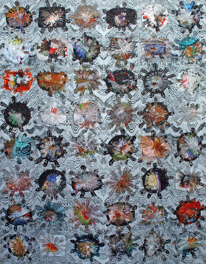
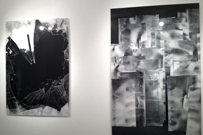
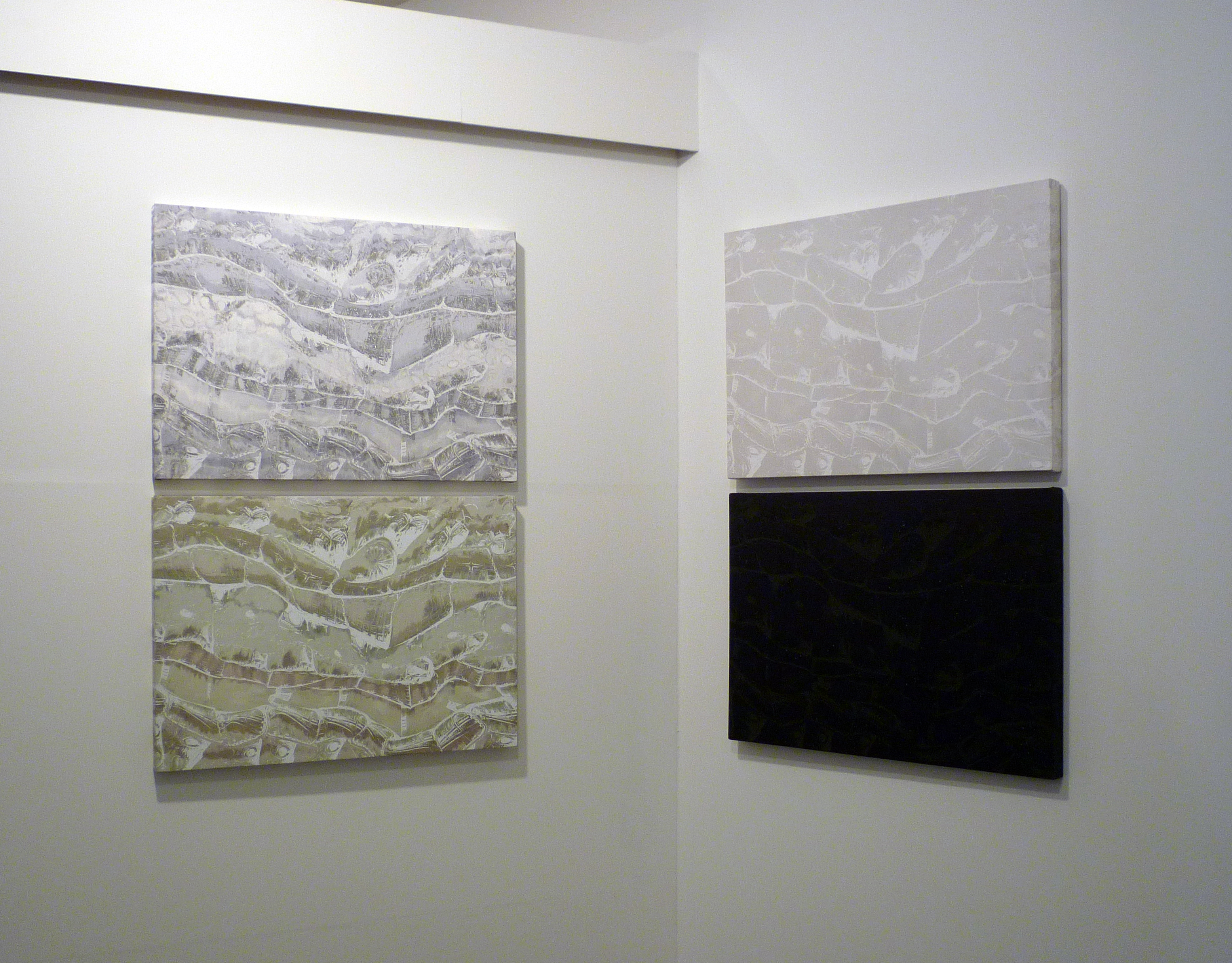
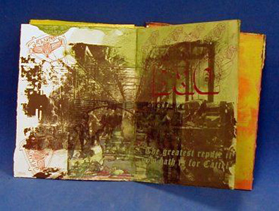
1304 Binformation

‘Binformation’ considers what new geology might be formed from the cocktail of ingredients disposed of in our landfill sites.

This work was originally completed for an exhibition about pattern. I was thinking about patterns of behaviour as well as creating a pattern from the imagery.

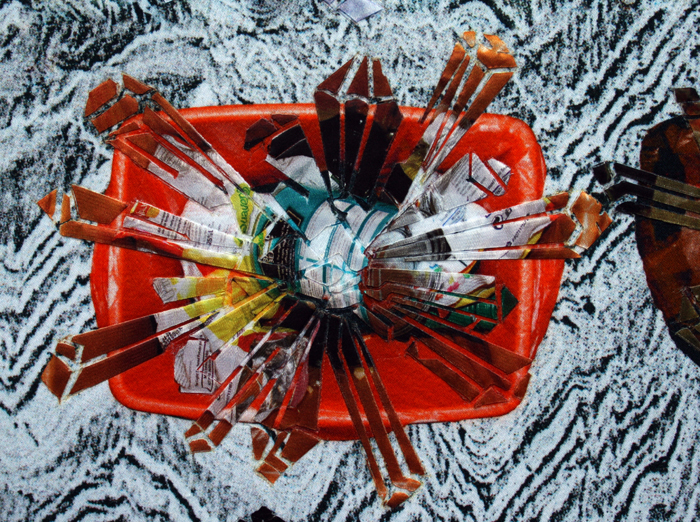
I cycled round to all my friends and neighbours knocking on their doors and asking to photograph their kitchen bin.

I hadn’t realised beforehand how personal a request this was. There was a lot of offers to see the recycling instead and excuses for what was in the bin at the time.

Things have moved on a bit since those days – not so long ago really but the amount of recycling we do now has increased dramatically since 2008.

There will still be that  layer of plastic under the earth for future generations to mine. I used the photographs to create an idea of rock crystals forming from our waste.
We have all participated in a global experiment with unknown consequences.

1304 Binformation detail

The kitchen bin is a surprisingly private space often laden with guilt and there is a certain amount of voyeurism in seeing what other people have put in their bin.

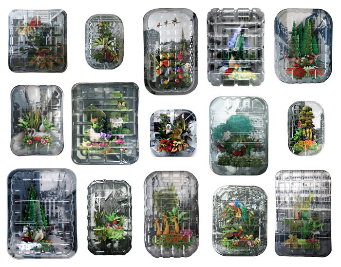
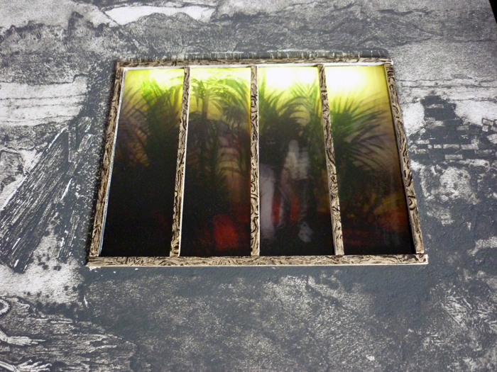
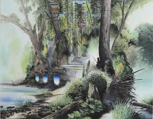
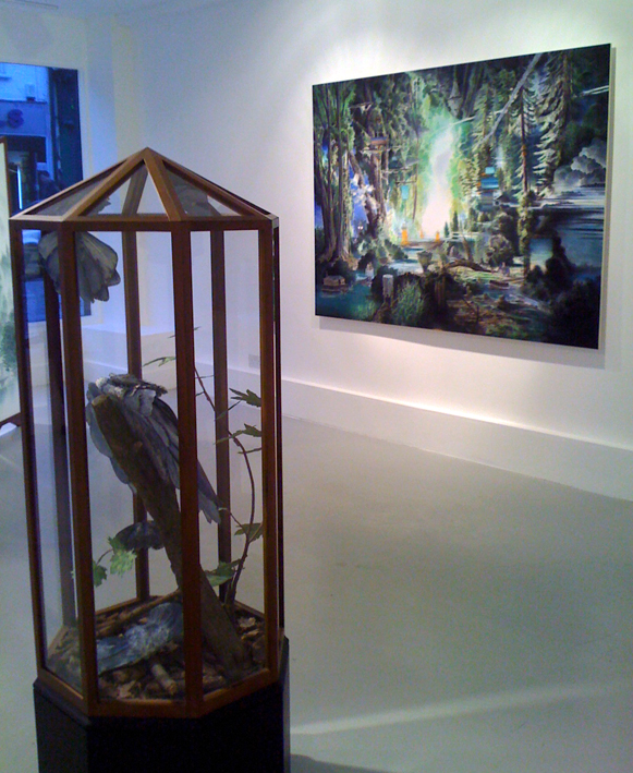
‘Collected Thoughts’ draws on ideas of preservation and references the Victorian enthusiasm for creating romantic tableaux of the natural world held in glass domes.

1304 Collected Thoughts

A contemporary plastic food packaging tray replaces the glass dome distorting the view of an apparently idyllic scene caught against a grey urban backdrop as in a moment’s hazy daydream.

Something else fast becoming history as plastic trays are used less and less.

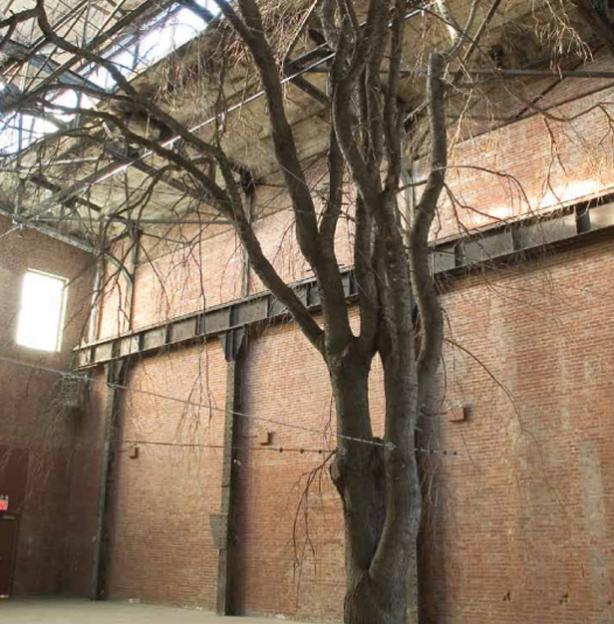
I went to hear Anya Gallacio talk at Whitechapel Gallery as part of the To Make a Tree series.

Anya Gallacio

Anya Gallacio

She was in conversation with Jon Thompson an ex Goldsmiths tutor and Phyllida Barlow.

The most memorable thing about the talk for me was the number of times she started her reply to a question with ‘I don’t know…’

There was little discussion about trees which I didn’t mind as I found the topic which the conversation  kept returning to of teaching methods at Goldsmiths and other art colleges to be interesting.

It seems even back in the YBA days things were harsh at Goldsmiths – Richard Wentworth told Anya to throw her work out of the window as it was rubbish.

Phyllida reminisced about having to pick up the pieces of emotionally destroyed students who had been locked in the notorious Room B at St Martins but escaped to Chelsea. I wish she had been my tutor as she sounded keen to develop a student not crush them.

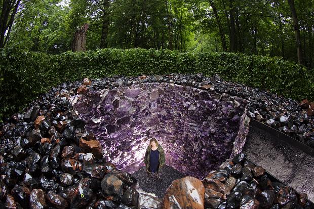
Maybe it was all for the good and in Anya’s case gave her good grounding to stand up for herself at Damien’s Frieze when feeling sidelined with limited space to exhibit she poured lead directly on the floor. Since then she has enjoyed making work that lets the material speak for itself. Flowers that dry up, fruit that rots. She has recently completed a new work in Edinburgh ‘The Light Pours Out of Me’. An amethyst lined grotto cut into the earth and surrounded with black stone and the green of the woodland, she wanted it to be something people would stumble across and wonder whether they should enter. Enticed by the beauty but fearful of the jagged edges.

'The light pours out of me' Anya Gallacio

‘The light pours out of me’ Anya Gallacio

Laure Provost won the Max Mara art prize for women and has her work showing at Whitechapel Gallery.

Laure Provost

Laure Provost

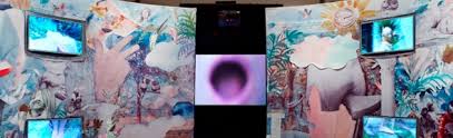
It is an incredible sensual piece of work made during her residence in Italy and inspired by the rich history of the female bather.

The centre piece is a pink mouth opening repetitively to a soundtrack which suggests both orgasm and the gasp of entering cold water.

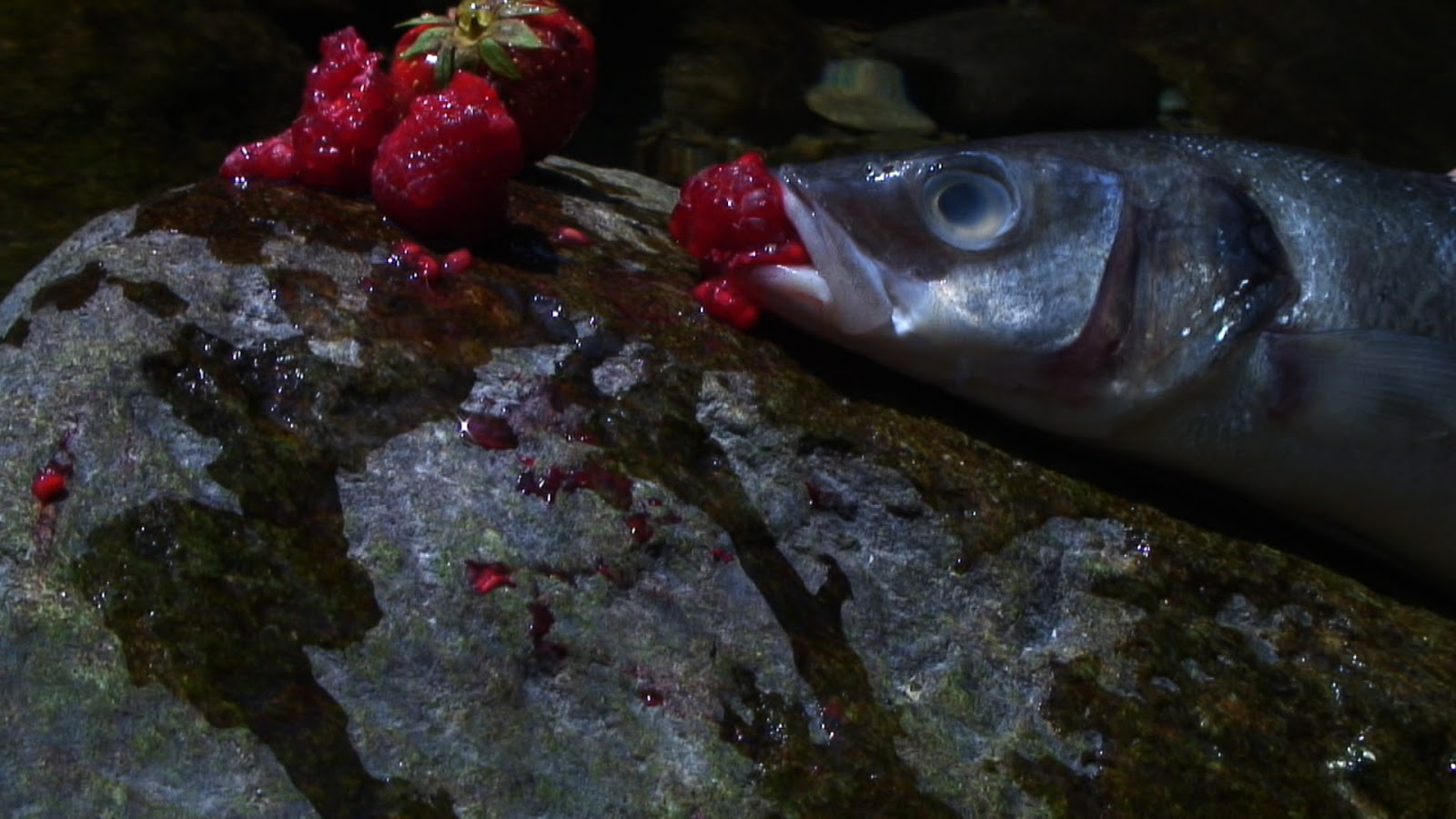
There are circling motions, direct eye contact, demure slipping into water, fresh raspberries proffered from large sculptural spoons, bounty and pleasure.

Laure Provost Swallow

Laure Provost Swallow

Back in the studio I have been continuing work on ‘Return of the Forests’.
I made relief plates for the iceberg collagraph and made new carborundum collagraph plates of the forest.

1304 forest collagraph
This time I sprayed the carborundum with Polyurethane varnish before coating with Shellac.

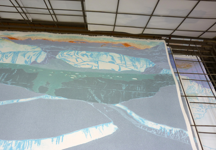
1304 iceberg
I made some prints with the iceberg collagraph and relief plates – the main problem was getting the inks pale enough. You only need a tiny bit of ink to extender.

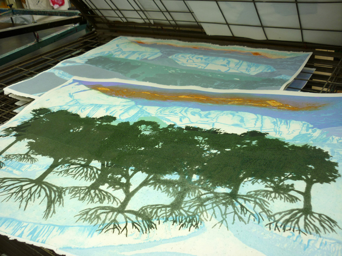
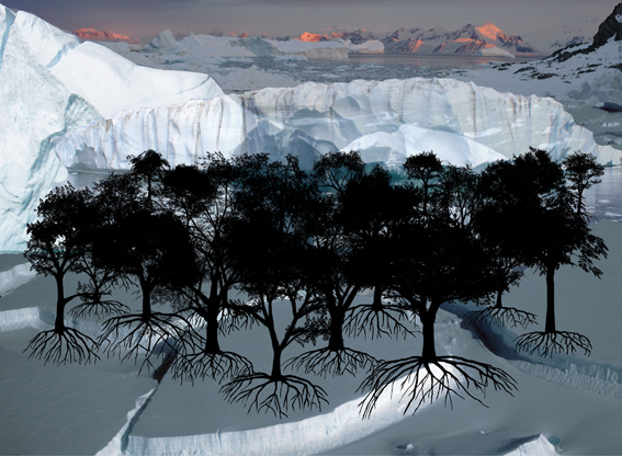
1304 trees on iceberg

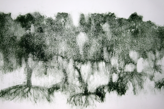
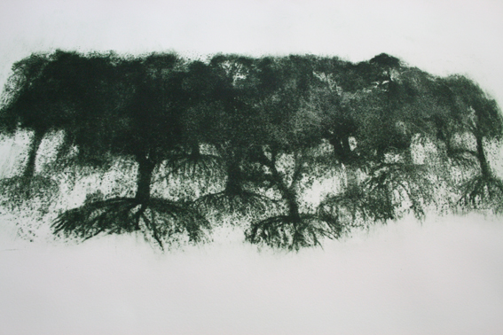
I test printed tree collagraphs, the detail wasn’t as fine as I had hoped but the murky atmosphere was quite effective.

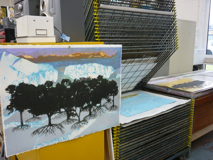
1304 return of the forest

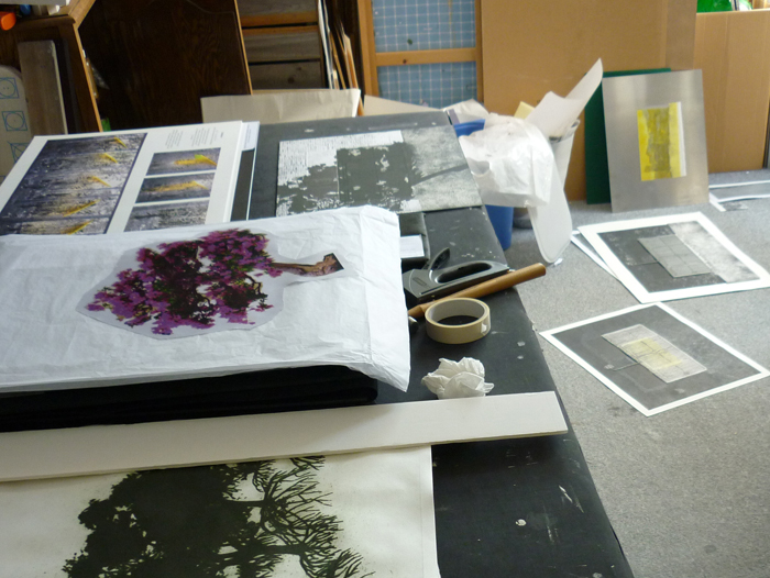
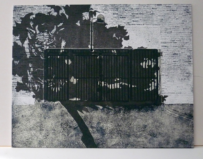
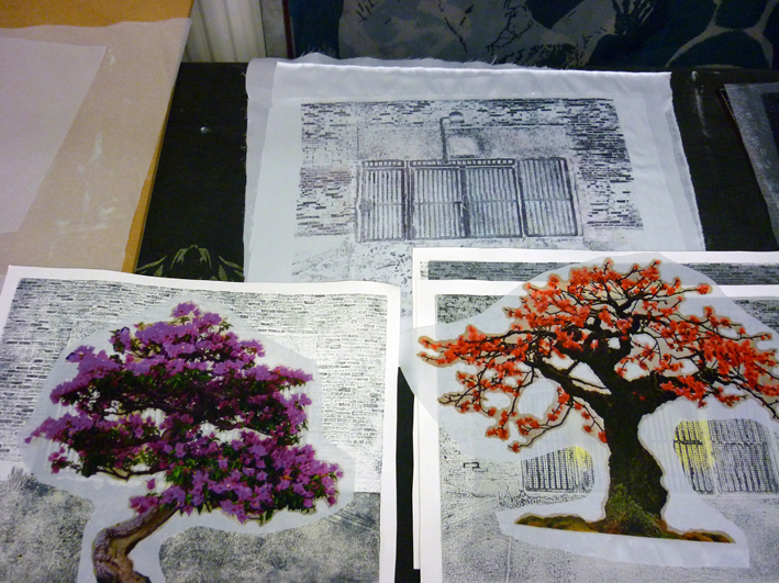
I also continued work on another collagraph – collaging two images together. The same background as I used in Graft i & ii of a gated car park entrance.

I spent some time drawing a shadow for the fantasy tree which I wanted to take root here. I wanted the shadow to be menacing and in the end went for it outright.

I drew the outline of a devil beast into the shadow and made a relief plate out of thin card.

1304 Shadow

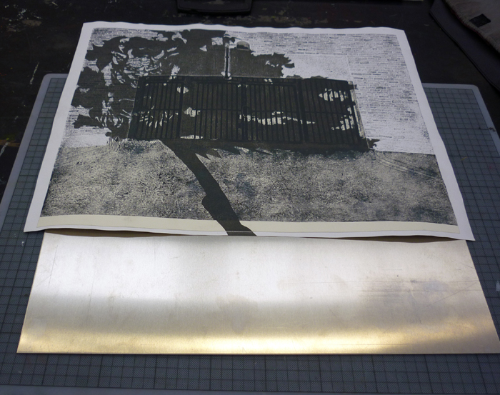
I printed this over the collagraph and mounted it onto aluminium.

1304 mounting on aluminium

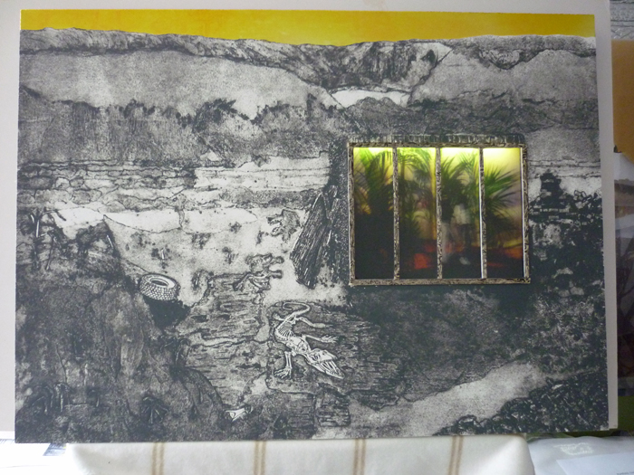
I kept looking at ‘Yellow Sky’ in different lights and decided that it really did need lighting from inside.

Yellow Sky

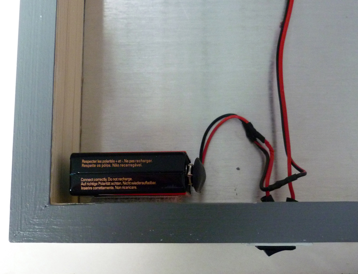
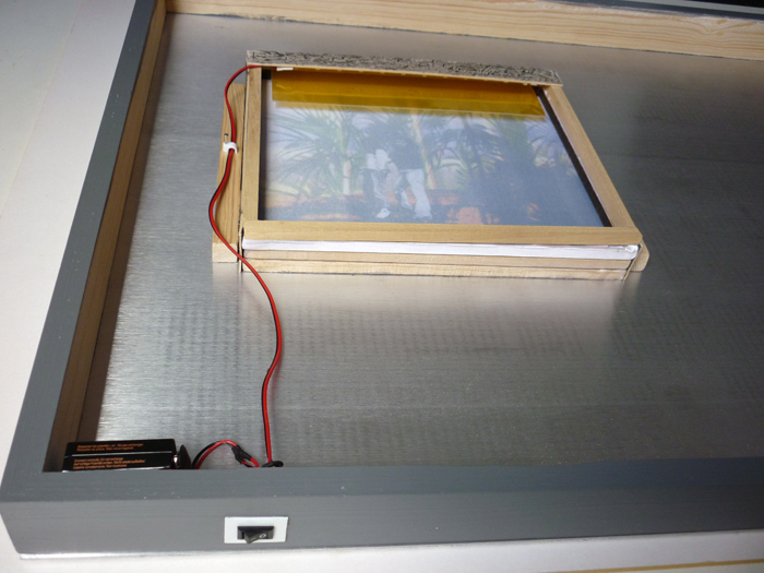
I tried testing the LED strip lights I have to see if they would light from a battery and found they did using a 9v
I trawled eBay for a switch for this and amazingly found someone who wires up LED strip lights to a 9v battery with a switch to a specified length of wire and all for £6.60 battery included!

1304 Yellow sky battery

The LED strip was only 20cm in length but this was perfect for the inset piece.

1304 yellow filter

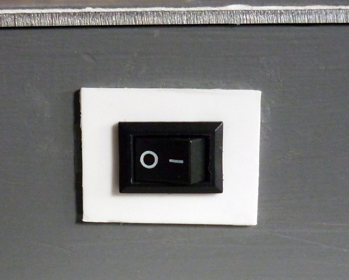
Felt very clever when I fitted this. I had to cut a hole through the frame for the switch which took me all day with a small chisel and various dremel attachments.

I cut a small plate out of rigid plastic for the switch to sit on and so it is all very neat and no wires and plugs to deal with.

1304 switch

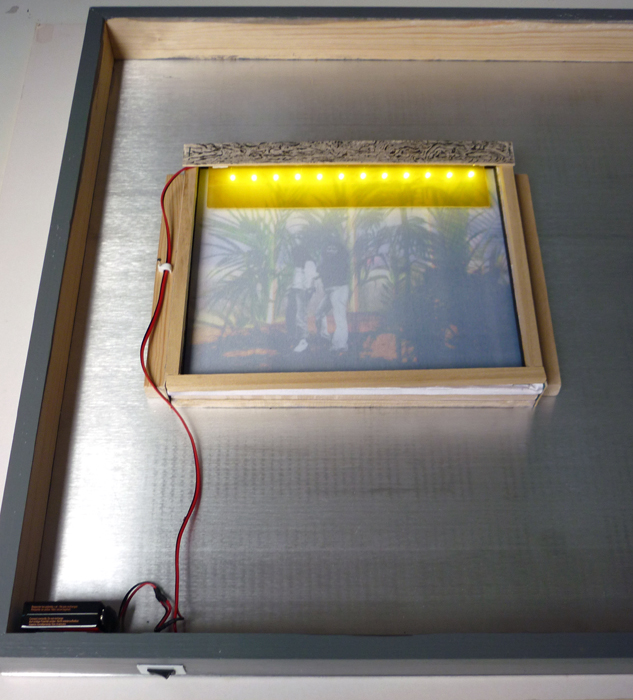
I gave the LED’s a yellow filter with film over acetate to match the yellow sky.

1304 Yellow sky back

I am excited by this whole process and what possibilities it offers. I need to find out how long a length of LED’s can be lit with a battery.

1304 Yellow Sky inset

I feel the work is more balanced now the inset piece is lit.

1304 Yellow sky lit

Had a super evening at Great Western Studios Private View.

An exhibition focusing on prints based on photographic imagery curated by Sumi Pereira and presented by Printmakers Council.

The exhibition aimed to show both traditional skills and innovatory printmaking techniques.

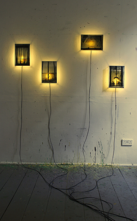
Lidija Antanasijevic

Lidija Antanasijevic

Lidija Antanasijevic explores raw emotion and inner energy seeking to give form to senses and experiences.

In this instance the wires add to the work.

Looked a vibrant place to work and show work.

Particularly enjoyed Chris Mercier’s work here.

Chris Mercier 'The Unraveler'

Chris Mercier ‘The Unraveler’


The bliss of ignorance. Those lovely few weeks when the future still held the possibility that I would be accepted on the printmaking course at the RCA.
I was expecting a letter so was unprepared to suddenly come across an email while at the studio idly checking my phone. It took at least 10 minutes before I could open it.
Scrolling down the tiny screen until I came to the numbing – very sorry…
Now I know how much I wanted it. No sense of relief about avoiding all the stress it will entail just a complete deflation.
I have however been put on the reserve list and am apparently very high up the list – now I just need a victim of circumstance – would that it could be someone who has decided to study elsewhere.
So there is still a tiny whiff of opportunity which could hang over me all summer.

But the important thing is to keep on making work.

Enjoyed my visit to see This Me of Mine at A.P.T especially as I got to chat with the curator Jane Boyer about the show.
It was one of those conversations where you end up in a silence of contemplation, wondering what the future holds and knowing it goes on regardless. Jane is concerned about the impact the digital age will have on our sense of identity. The exhibition is designed to creat a dialogue about the changes we might face in the future trying to maintain our identity and looks to personal stories, family connections and memories that anchor us to past and place. Leaving or creating an impression of ourselves and how that impression can be manipulated or misread.

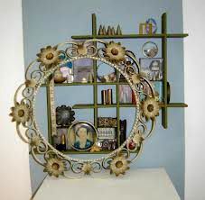
Kate Murdoch - It's the little things

Kate Murdoch – It’s the little things

Kate Murdoch’s work ‘It’s the little things’ – a portrait of  her grandmother described by an assemblage of personal paraphernalia from her life caused a strong physical reaction in me – nostalgia is such a powerful emotion especially when it comes unexpectedly. Being confronted with a hair curler like my Mum used to wear and an ornament with cut glass coloured eyes like one I had when I was small was such a stomach lurching reel back through time. A younger person who doesn’t have those memories to evoke would have a very different experience of Kate’s work.

Anthony Boswell - Time Box

Anthony Boswell – Time Box

Anthony Boswell’s Time Box was clever and unexpected. Like a set from a film noir it draws you in and then catches you unawares turning the world upside-down as you come face to face with time.

Dahlstrom and Fattal showing at Beers Lambert was a stylish show. Culturally though I felt I seemed to miss something in the viewing.

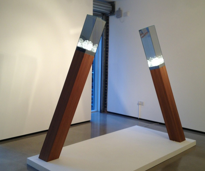
Amir Fattal

Amir Fattal

Amir Fattal creates sculptures in a mid-century modern style. Clean and beautiful lines with fashionably retro light fittings.

Elevated, toppling trapped illuminated crystals like brains from a science fiction scenario.

Oystein Dahlstrom

Oystein Dahlstrom

Oystein Dahlstrom makes ‘digital renderings of the natural world that masquerade as truth’ We are to view these images not as photographs but as simulacra. They are fascinating works showing heightened detail as a celebration of materiality while giving the material no context.

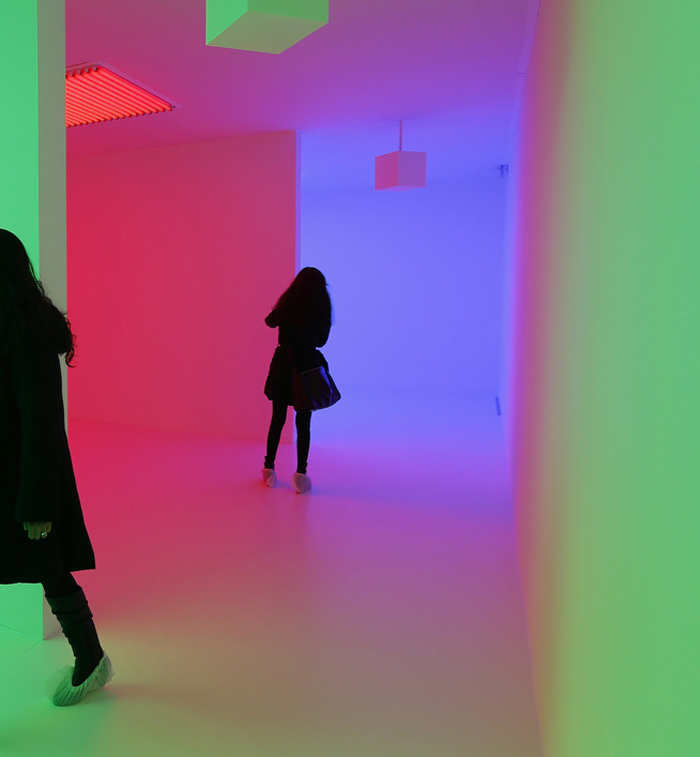
Carlos Cruz Diez

Carlos Cruz Diez

Light Show at the Hayward Gallery was pure spectacle. A fairground of pulsating, flashing, glowing colours, clever illusions and optical trickery.

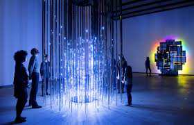
Leo Villareal and David Batchelor

Leo Villareal and David Batchelor

The subtle work of Katie Paterson was a calm moment allowing us to experience standing in the moonlight but indoors.

Lightbulb to simulate moonlight gives us a rare opportunity in the city.

1304 Katie Paterson

Katie Paterson

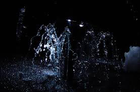
Olafur Eliasson’s model for a timeless garden drew an audible WOW on entry – it was a theatrical moment of pure joy.

Olafur Eliasson

Olafur Eliasson

Rows of water fountains are frozen in unison under strobe lighting creating constantly changing sculptures. Natural phenomena captured. You enter this space after contemplating scenes of soldiers under fire and in combat, the matter of fact disclosure of horrific events on an ever rotating Reuters style news feed so the contrast of emotion is marked.

Jenny Holzer

Jenny Holzer

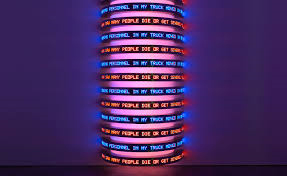
Jenny Holzer brought some serious reflection in her revolving towers of words of the accounts from declassified US government documents from the ‘war on terror’.

More illusions, time travel and identity crisis in Cloud Atlas.  Our lives are not our own. Through the ages our actions either good or evil count and carry events forward.

1304 Cloud Atlas
The film was bold and exciting. Clever use of film genres mimicked the varied literary styles of the novel and you didn’t have to wait till the end to make all connections as the eras were spliced together so it was easy to follow each plot line and still see parallels across time. It was worth seeing just to witness the amazing makeover each actor received when playing a different character in another age.

What is the ocean but a multitude of drops.

130313 (1)

Time condensed and expanded.

When you need to present your best ideas in a coherent and articulate fashion trying to be sure you cover all points without hesitation repetition or deviation you would think 20 minutes would seem an age to fill but in fact it went in a flash. Then you are left wondering how you came across. It was the most glorious sunny day for my interview at the RCA and the board were very welcoming and encouraging as I battled to speak while remembering to breathe. It was all very straightforward. Just talk about my work and why I want to go, what I want to achieve conceptually and technically. Explain the motivation behind my new work, offer some criticism of my work. Nothing tricky but lots more people for them to interview so I just have to wait and see. I feel I have been very honest about myself and am really pleased I was given an interview.

parrallax

I went along to Cafe Gallery Projects to see what the 2nd year RCA Printmaking students were up to in their public exhibition. Right by the door was a very low table covered in a white cloth, on it was the plaster head of an asian girl . As I entered the draught from the door seemed to cause a reaction, the head moved slightly and I realised it was a live head caked in make-up. Also on the table were bowls of what looked like spices and kecap manis and spoons so the public could ladle condiments over her head. The girl was obviously a contortionist and very good at keeping still for 2 hours, a test of endurance even without sticky sauce and irritant seasonings being trickled over your face. I don’t know if it was the artist herself or not but it was a captivating spectacle, disturbing and questioning complicity. I was rather anxious looking at the show in case I found myself next to a tutor and in another interview situation so I navigated the space quite quickly. I didn’t make a note of any names of the students but I will be interested to see how their work develops before the upcoming end of year show. My favourite piece was a video showing two rectangular receptacles cast in concrete filled with dry ice, light was projected onto the sides and there was some kind of mini explosion within. The concrete looked translucent as the mist bubbled over the sides like some mystical ancient relic. It was beautiful like an Ori Gersht film is beautiful. Some work I found perplexing – not sure whether to blame my own shortcomings or just accept there is art like people that I just don’t get.

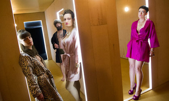
The latest piece of promenade  theatre from dreamthinkspeak ‘In the beginning was the end’ at Somerset House was also perplexing.

dreamspeakthink

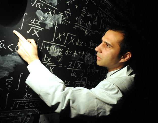
Left to negotiate endless corridors and rooms filled with unexplained scientific equipment, being corralled into demonstration areas for new technologies by a variety of ‘men in white coats’ non of which spoke english the audience looked hard for clues to a narrative.

dreamthinkspeak-in-the-beginning

If it had been billed as an art installation maybe expectations would have been different. The rudimentary enactment of corporate failure felt weak for the huge effort put into the infrastructure and the setting which was astonishing for its scale and vision. It wasn’t until the exit that you were provided with an explanation if you needed one of what you had experienced.

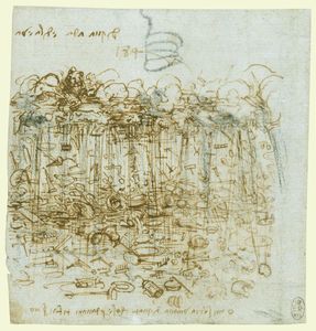
Looking back to Leonardo Da Vinci’s drawing ‘ A Cloudburst of Material Possessions’ dreamthinkspeak take his concerns for humanity obsessed with the material world and fast forward to a future of economic collapse.

Leonardo Da Vinci

Finally on leaving the constructed sets a moment of true wonder, looking up into a maze of architectural delights, arches and stairways that lead back to the courtyard of Somerset House. Diagon Alley was mentioned.

somerset house

Must plan to go on one of their free guided tours at some point.

Dale Devereux Barker came to speak at Ochre Print Studio.

dale-dev-barker

It was interesting to hear about his large scale installation projects involving turning his small lino cut imagery into large enamel sheets. I liked his attitude to printmaking – if you don’t know what the rules are you’re not afraid to break them. I also agreed with him that being faced with walls of framed works behind glass such as at the Mall Galleries drains the work and any stamina you might have to view it. In such circumstances how do you make your work captivate an audience.
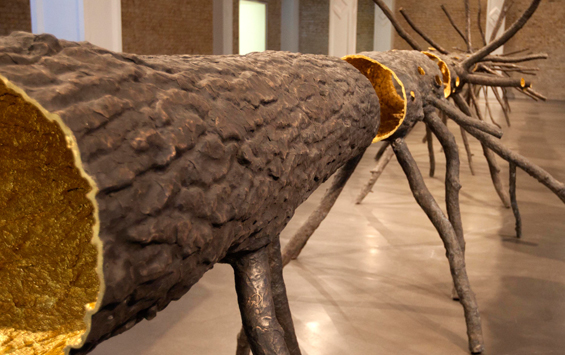
Artist Giuseppe Penone examines our relationship to nature and for his latest work he has created a twelve metre bronze cast of a tree, with a gold-leaf clad interior.

Guiseppe Penone

It looks like a giant  insect scuttling across the length of the gallery. It is called ‘Space of Light’ as where the tree was is now a golden void. Looking down the centre of this void is like looking down Alice’s rabbit hole – it looks endless and magical. The tree has been turned inside out – the bark now on the inside, the outside informed with prints of the hands that sculpted it, together it defines the inseparable bond between humankind and nature. To accompany the installation Whitechapel Gallery is hosting talks and events exploring the relationship between nature and the city.

At her talk in the series ‘To Make a Tree’ Finnish artist Eija-Liisa Ahtila explained her interest and difficulties encountered in making a life size portrait of a tree. She comes form a background of painting and filmmaking and her work is very much about the rules of filmmaking but considering the protagonist of a story to be someone or something other than an actor.

Ahtila-Antropomorfa

Through drawing she makes her tree a character. She talked of her quest in casting a tree in the role of protagonist. Searching for the perfect tree to fulfill this role. The spruce is so ubiquitous for the Finnish people that in choosing such a common tree to put under the spot light and make a star of her film she echoes the fantasy of the undiscovered talent plucked from obscurity. Her interest is also in thinking about the tree as having a parallel life to the lives of humans and wishing to respect other living things that we share the planet with as equal to ourselves in value. She wanted to experience the tree as a whole – not looking up from below but in its entirety. In the final work we view the tree on its side split across 6 video screens undulating in strong winds with an added soundtrack of birdsong.

Eija-Liisa Ahtila

We are still displaced from the tree by the media but we can contemplate the vast size and the time passing necessary to create this giant.

Wieland Payer whose work I first saw at RCA SHOW 2011 has an exciting solo exhibition at Man & Eve Gallery now, conveniently for me, relocated in the wonderfully eclectic Lower Marsh.

Wieland Payer
His work seems to span time. The medium of pastels seems fitting for his subject as it has an old fashioned quality which imbues the atmosphere of his work with notions of a bucolic past. It softens the reception of his imagery and adds to the surrealism of the landscapes planted with ambiguous structures which could be futuristic or from abandoned civilizations. There are signs of conflict and a need for refuge amidst the soaring beauty of impossibly tall trees and romantic rocky outcrops.

Wieland Payer 1

Outsize blue moth sculptures have seemingly emerged from the flat of the drawing and been captured and displayed in a glass cabinet. Their bodies made from paper and coloured with the same pastels as the world from which they came.

I am entranced by his work and the paths it leads me down.

Wieland Payer 2

portfolio

The tension of waiting to hear if my portfolio had managed to gain me an interview at the RCA built as the date when results were supposed to be emailed came and went with nothing happening.

When news finally arrived 5 days late that I did have an interview I felt I had just stepped onto a very high rollercoaster.

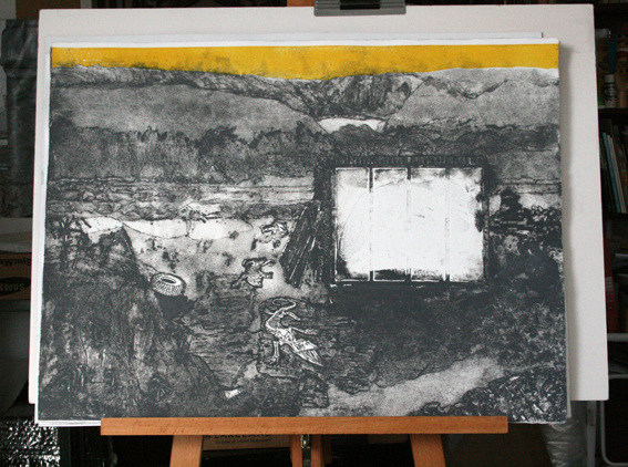
Suddenly I was all fingers and thumbs and the new work took on a magnitude it didn’t deserve. I was working on a collagraph of a desolate landscape. Within the landscape would be a glasshouse – a protected environment where things could grow. I had been thinking about conservation and how reliant so many species are on being sited within a protected environment for survival. Building a safe environment. That idea of a haven. My first ideas for inside the glasshouse were of a party amongst tropical plants but I found some photos I liked of children looking like frightened animals about to dash into the undergrowth and hide for safety.

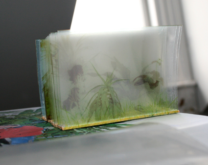
To create the layers inside the glasshouse I had an idea inspired by an old model I had made back at Goldsmiths using OSP transparencies. With just one plant on each layer the image soon disappears into haze. For some reason it always made me think of a prehistoric landscape.

OSP Model

I took the same principle but stacked the images and ran them through the scanner. The light gave a wonderful ethereal effect and I was excited by the number of combinations of layering that could be achieved.

Hot House

I contacted Promptside to organize the transfer of these images onto sublimation paper and also J & R Precision Engineers in Chiswick to get aluminium sheet cut for the print to sit on.

The print I had previously made from the collagraph that I thought was OK on reflection was not good enough so it was back to inking up and trying again.

I am still learning about the right consistency of ink to use, how much extender or plate oil to mix in, how best to apply the ink and then wipe it off.

Test print

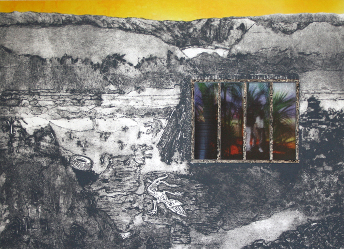
Suddenly it all seemed to come together and I had a print I was happy with. Apart from the sky which needed work. I wanted it to be a strong yellow – luminous yet poisonous.

Back at home I tried screenprinting onto polyester but the inks were too heavy and dull. I then tried painting sublimation inks and transferring this to polyester.

I ended up ironing this by hand as my heat press isn’t wide enough. This gave the sky a luminous glow which reflected onto the paper. I thought I could work with this.

So I cut the printed paper sky off and used 3M positionable adhesive to stick the polyester sky to the aluminium plate and again to stick the paper print on top.

Initially I had wanted to make the glasshouse quite 3D even protruding a little from the print. Once I had carefully cut the hole in the print for the glasshouse to sit in it seemed it would work better if the images on organza sat directly behind the print with the glasshouse framework sitting on top.

So I printed some balsa wood to make it look well, like wood.

balsa wood

I transferred the images I had collected from Promptside onto organza and polyester and then chose the one I thought most effective. I made some small stretchers for these. I had thought about trapping each image between an acetate sheet but having stretchers helps with the spacing. The image inside the glasshouse ended up being quite dark and I did think about lighting it with LED’s. I don’t really want to have to plug it in though but may have a look at finding a battery operated option with a small switch.

Yellow Sky

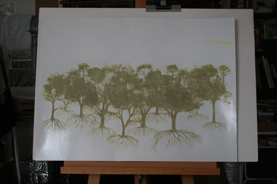
Alongside making this work I thought I would start the next piece I was planning about the return of the forests after the ice age.

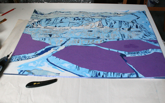
I mocked up a landscape from collaging images of icebergs and frozen sea together to give the impression of a land breaking up and transferred this to card for a collagraph plate.

iceberg plate

I wanted to have the forest emerging from this icy landscape, dark and advancing like Birnham forest in Macbeth.

At first I thought just the tops would be visible but then I decided to show the roots taking hold – visible in the ice.

return of the forest

I mocked up an idea of this in Photoshop but this would mean a lot of cutting for a collagraph plate. I could screen print it but I wanted to create a more ethereal effect so I had the idea to screen print the trees onto card and dust the ink with fine carborundum grit  before it dried. It meant i could get much more detail in the plate than by cutting it. Of course I would need to seal the plate and I used the very last of my Klear to do this.

Carborundum forest plate 2

I should have realised the carborundum would spread with the brush and I consequently lost some of the fine detail. I printed this plate to see how it came out, it looked like a forest dissolving in the rain and I think on a background print could be effective.

dissolving forest darker print forest

There had been a documentary programme on TV about a group of Scandinavian artists and scientists that had gone on an expedition to a glacier a bit like Cape Farewell. These Scandinavians were not so poetic in their approach and much more used to dealing with survival outdoors – slicing the head of still battling fish and shooting warning shots at an inquisitive polar bear before taking off on a jet powered hovercoptor. The geologist was interesting though and more introspective – searching for something within himself amongst the oldest rocks on the planet. He talked about snowball earth when the whole planet was covered in ice. This seems to have happened a few times – the last time being 635 million years ago.

I have been trying to find out when the trees first appeared – maybe 551-2500 million years ago.

‘As I did stand my watch upon the hill,
I look’d toward Birnam, and anon, methought,
The wood began to move.’

ACT V Scene v Macbeth

Colour was up for discussion at the Will Gompertz Fringe at the ICA. The concept of these events was to create a condensed festival with music, comedy, literature, art and performance happening on separate stages. It had a relaxed  ramshackle quality.  The mind-boggling colour changes promised using chemicals to be demonstrated by Dr Suze Kundu was replaced by a brave but unprepared stand up comedian as the scientist had come down with the norovirus. Some science was provided by the Festival of the Spoken Nerd who gave a mini lecture on how our brain mixes colours from light hitting just 3 receptor cones in our eyes into the millions of shades that we see and how some women can see millions more colours than everyone else due to an extra receptor. It is impossible to know if each of us sees the same object as the same colour and quite likely that we don’t. As an artist choosing colour so exactly that is an interesting thought to consider. Insects and birds can differentiate way more colours than humans with top colour mixer being a little shrimp.

David Batchelor was one of the speakers but seemed unsure what to talk about after telling us it wasn’t really understood how we see colour and  insisting that he wouldn’t end up talking about himself which of course we would have liked and so he cut his talk short.

David Batchelor

Alan Connor ran a quiz reducing a well known painting down to a few coloured pixels and then increasing the colours until someone guessed what it was.

ica_blog alan connor

Some people guessed very early on – they must be very familiar with the paintings. Maybe art historians or something.

Jonny Woo and Batty Lashes literally added colour to the evening in zinging yellow tights and wigs.

Jonny Woo

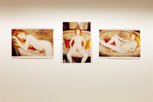
The previous week Icons had been the topic. First up was Matt Collishaw and this was to be the highlight for us but SouthWest trains let us down badly and we were an hour late, arriving just as he left the stage and passing him as we negotiated our way past Juergen Teller’s billboard sized photographs of a brightly lit Vivienne Westwood displaying her newly coloured pubic hair. Arresting images.

Juergen-Teller-Vivienne-Westwood

I didn’t go to the third event about money but did think the whole concept of mixing arts, science and comedy into one evening a good one. It provides fresh angles on a given theme.

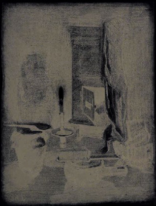
From the spotlight to the flickering of candles illuminating still life arrangements of skulls, polished silver and glass at Blackheath Conservatoire for the Drawing Salon organised as a fundraiser to echo the days when the Salon first opened.

Blackheath crop

It is actually very hard to draw by candle light  – the flames burn into your retina forcing you to squint and look away. It was a hugely popular evening packed with people at easels and perched on stools board on knee to capture in charcoal the gleams and  shadows of the tableaux. There were life models, live music provided by the conservatoires musicians, silhouette cutting Victorian style, lots of wine and costumed tutors which made it quite a theatrical and mellow experience.

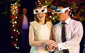
Entered a rose tinted world when 3D glasses that turn every point of light into multiple bright red hearts were provided for the audience during the Opera Up Close great kitsch performance of L’elisir d’amore at the Kings Head Theatre. Persuaded the usher to sell me a pair.

l'elisir

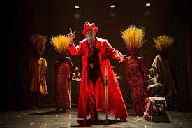
Saturated colours with all the heat of the African sun lit up the stage for Feast at the Young Vic. The staging was extremely clever, it was fast and bright and funny.

Feast

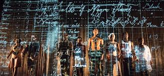
One character became another in a magical flash of light, digging deep into ancient rituals and transporting us through history at breakneck speed. Amazing.

feast 3

Thinking about how I use colour in my own work. I can’t pull myself away from the grayscale used in contrast to the synthetically bright.

A lot of my work comes back to this idea of breaking through the grey monotony of life to discover some vibrant fantasy world. But in fact I love grey, it is my favourite colour.

However, you can only have a favourite if you have the choice.


London Art Fair.

Hadn’t been before. It felt manageable though we didn’t go round all of it. Headed straight to the Art Projects Space.

Bearspace had a good spot and were showing Suzanne Moxhay’s enigmatic photographs.

Susanne Moxhay

Suzanne Moxhay

I love the way her photos are staged. I have been looking at other artists that use a similar process of building sets to photograph.

Didier Massard (2)

Didier Massard

Didier Massard for example. I stumbled across a blog about his work a while ago.

Edwin Zwakman

Edwin Zwakman

Other artists are mentioned in this blog one of which is Edwin Zwakman who constructs miniature landscapes to photograph entirely from memory. Through his process all places and objects morph into new variations. Scale and perspective change. The images do not show what you could photograph but how you experience them.

I like this idea and so for the new collagraph I am making I thought I would try this approach.  Is it possible to see something in your mind that isn’t constructed from things you have actually seen and to see that immediately as a sudden flash.  My ideas seem to grow slowly in my mind, fermenting over time and then suddenly they seem ready to go from there to a very rough sketch to a plan of action.

I am aiming for a scene of desolation, a dystopic landscape – a clearing reduced to ruins. Then a last refuge. I see this as a glass house, a protected environment for things to grow.

I have bought some A1 card for the plate and am experimenting with making structures from paper and card. I am planning eventually to insert the glasshouse as a shallow 3D model into the collagraph. Eventually made from acetate and filled with sublimation printed organza images.

I have taken up key holder membership at Ochre Print Studio. This gives me full-time access to the studio so I have more time to experiment and be playful with my work. It is great to feel the whole day stretching out ahead of you without the worry of clearing up almost as soon as you have got started. I am a slow worker so I need this.

I also bought an easel with some birthday money. My studio has had a big clear out and one side looks refreshed and ready for a new episode in my work. Other side still piled up but progress is being made.

I was able to get lots of tips on different ways to print collagraphs from Katherine Jones course at Ochre.

Katherine Jones Stove

Katherine Jones ‘Stove’ Etching and collagraph on paper

Katie was really helpful and her work is beautiful. I love her colours.  She creates a wonderful ephemeral light in her work. She has done a series on conservatories. It felt a bit weird to discover this as it looks like I was copying her.

Stove is a reference to John Paxton’s ‘Great Stove’, a hothouse built and designed for the gardens of Chatsworth House in the 1800s which was later dismantled.

I asked her if she had come across Frank Stainbridge in her research about hothouses but she hadn’t. One day I will try to find out if the extraordinary stories about him are true.

It was encouraging for us to see how many prints Katie made from one plate before she was happy, changing the colours, adding and removing sections until it all came together.

Collagraph Plate

I have got my collagraph plate to a point where I want to see how it prints.

Collagraph relief

I made an impression of the print on card ready to cut as a relief print to add layers.

While thoughts of the forest and the bestial freedom that Vico wrote about in his ‘New Science’ are in my mind these thoughts have been reinforced by Haruki Murakami in 1Q84 which is my novel on the go at the moment.

The character Tengo reads passages from Anton Chekov’s Sakhalin Island to Fuka-Eri. Chekov writes about his encounters with the indigenous people, the Gilyaks (now known as Nivhk) ‘….they do not understand the purpose of roads. Even where a road has already been laid, they will still journey through the taiga. One often sees them, their families and their dogs, picking their way across a quagmire right by the roadway.’

Fuka-Eri warns Tengo of the Little People’s wisdom and power – that it might cause him harm. ‘Better be careful in the forest. Tengo found himself looking at his surroundings. True, the forest was their world.’

I have spent a lot of time looking at my work and thinking about my intentions, going back to old statements and looking at my dissertation from 2007 to try to home in on the most prevalent themes and ideas. Disconnection from nature is something that I explored very early on in my practise along with ideas about desire for an idealised nature. This led me to the myth of paradise and trying to understand where desire originates and how paradise might be visualised. I see the connection between nature and desire as being the myth of paradise. To take these ideas further I want to look at the relationships and analogies that can be made between nature and the mind. Both beautiful and unpredictable.

forest

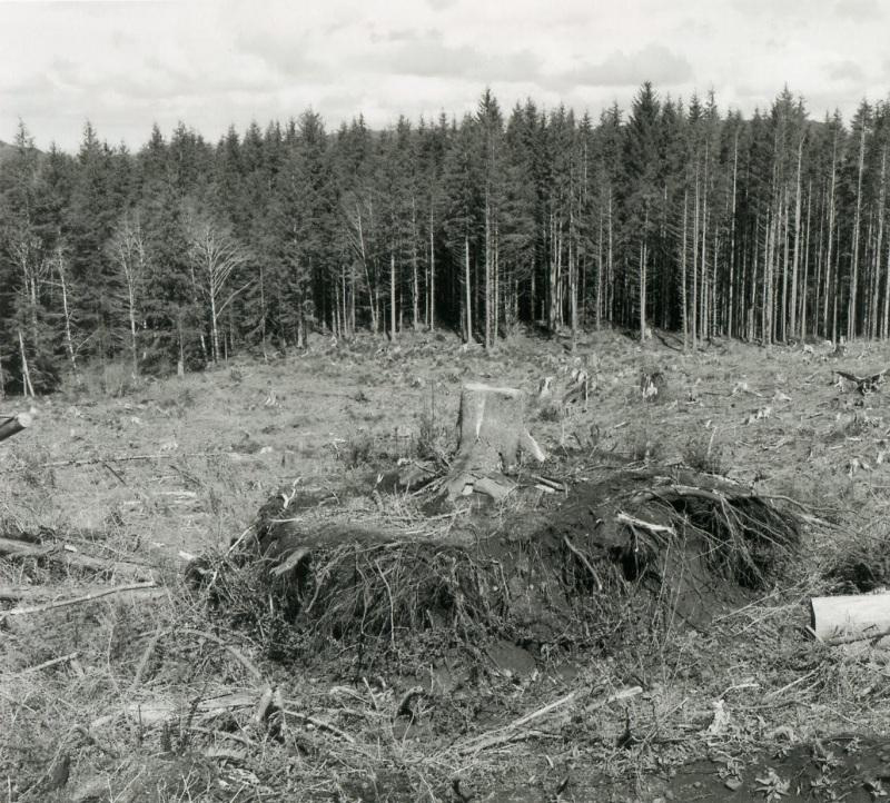
I have gone back to reading Robert Pogue Harrison’s book ‘Forests: The shadow of civilization’, going through it in more detail, annotating and making notes of references I want to understand in more detail. The main purpose of his book to is to examine the history of the forest in the cultural imagination and the consequences of the loss of these great wildernesses. In his first chapter he looks to the theoretical studies of Giambattista Vico written in 1744. Vico proposes the birth of religion began when man first read manifestations in nature to be the language of God. The first messages appeared to come from the sky – thunder and lightning, the movement of the stars this led to the conclusion that God must therefore reside somewhere above. As the sky was mostly hidden at this time by the dark canopy of the forest then God could not be seen but must be imagined. Nature became uncanny, no longer merely a habitat but a meaningful world. Vico’s analysis of ancient fables led him to believe that the bonds between humanity and nature were broken long ago as man established laws to govern the developing settlements, clearing the forest to put down the roots of civilization. Fables such as The Aeneid which tells of an Arcadian-like forest where man was born from the earth were already stimulating nostalgia for a time of unison with nature, a time before civilization, before religion.

Gordon Cheung 4

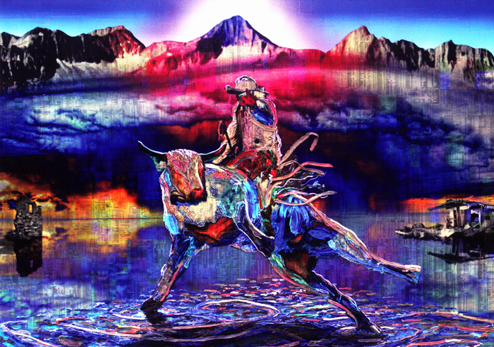
In his recent show ‘The Solar Cry’ at Edel Assanti Gordon Cheung portrayed a world teetering on the brink of collapse. In his customary style of techno sublime, he uses heavy layering and sculptural use of acrylic paints and dayglo gels and the financial times newspaper literally forms the backdrop to his landscapes.

Gordon Cheung 1

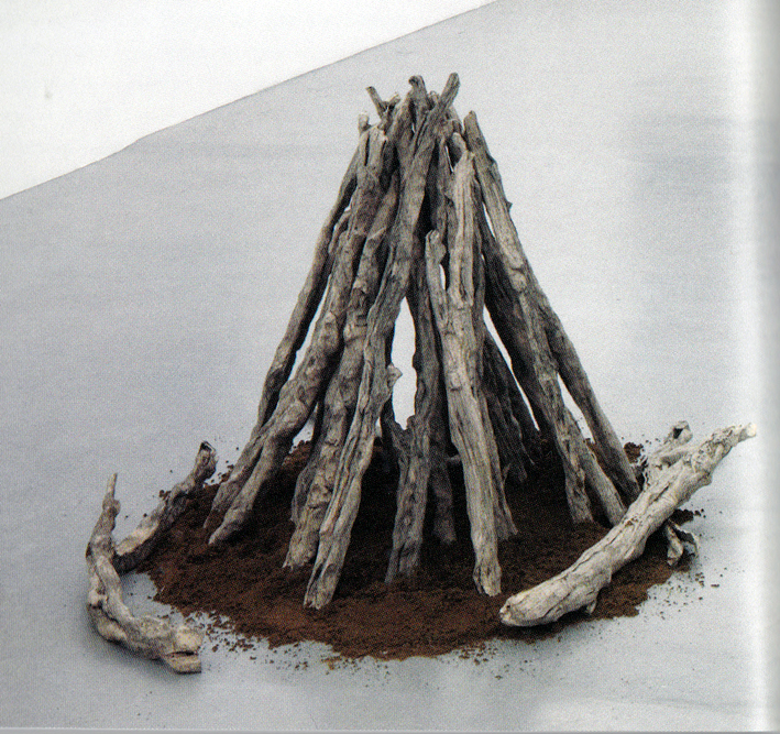
Taking this metaphor of the all pervading and powerful stock market further he has, through papier-mache, returned the financial listings full circle back to wood, back to the forest; but as the dead branches of driftwood, like beautiful fossils of a wonderful beast.

Gordon Cheung 2

In the catalogue to the exhibition he talks about his own interest in mythologies and the connections he makes between the stock market’s use of animistic symbols and similar uses in myths such as the Minotaur and the Mithraic cult’s bull sacrifice to the sun. From the earliest times to the present day our fear of an apocalyptic end is something we share, the threat itself however alters over time.

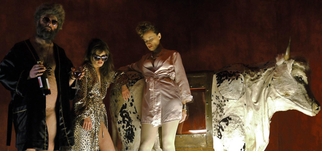
In Shunt’s recent theatrical production ‘The Architects’ the myth of the Minotaur was referenced, albeit rather obscurely.

Shunt The Architects 1

Ideas of bestiality, child sacrifice, control vs mayhem were explored aboard a cruise liner set which you entered via a genuinely disorientating labyrinth.

The Architects by Shunt

There were probably lots of references made to the original myth that were lost on us and we were waiting in vain for the chance to become a hero but we all really enjoyed the event.

0117 Shunt (3)

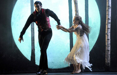
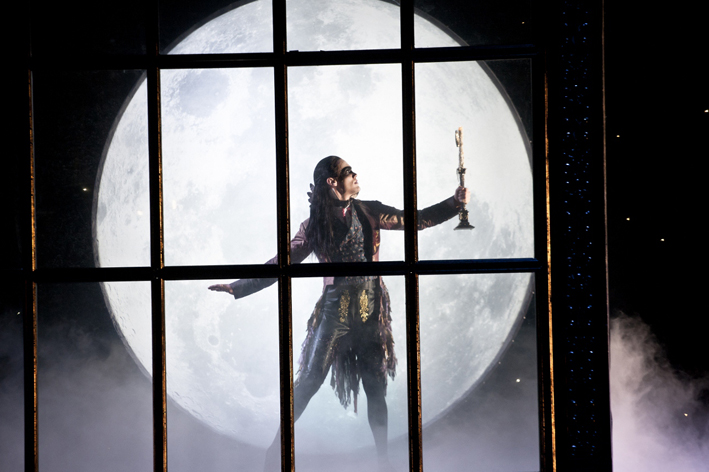
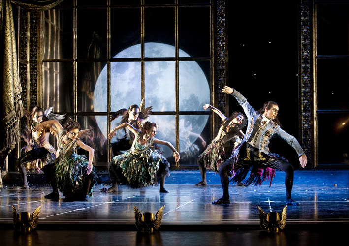
Adding to my current theme of myths and legends was a trip to Matthew Bourne’s Sleeping Beauty. Fables and fairy tales over the years have always varied slightly in the telling,  poetic license here turned the good fairy into a vampire and updated the story to allow for some sexed up turn of the century costumes.

Matthew Bourne Sleeping Beauty 1

The gothic layered onto classic romanticism made for a wonderful indulgent confection. And the dancing was superb.

Matthew Bourne Sleeping Beauty 3

subluna

Studio work – synthetic textiles on board

A day of contrasts was spent viewing the Turner Prize and The Pre-Raphaelites (Victorian Avant-Garde) at Tate Britain.

Luke Fowler was the favourite for me, I found his film ‘All Divided Selves’ about R.D. Laing fascinating enough to want to see it all and it was 98 mins long.

Then I liked Elizabeth Price video about the Woolworth’s fire. The clapping like the crackle of the fire building the drama of the story.

While I did appreciate the technical accomplishments of Paul Noble’s drawings they made me feel a bit queasy. All that amorphous flesh and the tilting perspective of his buildings gave me sea legs.

I did like the simplicity and characterful nature of his sculptures though. The Spartacus Chetwynd performance was a bit mystifying. I do like a theatrical event but the short episode with the puppets left the audience unsure if we had witnessed anything or not. I suppose I expected something a bit alarming – like if Beetlejuice turned up.

Since starting this blog the winner of the Turner prize has been announced. I am happy Elizabeth Price won. I think hers is a work I could go back to again and get more from.

The block buster pre-raphaelites show was heaving with people and with the gaudy reds greens and golds, general sumptuousness and crammed walls gave it an air of a Christmas market.

It was all a bit much, I started to feel the subjects in the paintings were only there to drape a fabric over to show off the skilful rendition of coarse cheesecloth or silky satins.

I thought I would be more drawn in to the romance of it all to connect with my own ideas of nostalgia for a natural world vanishing before us but in the end everything felt too solid, too defined.

There are common points I feel in what they were attempting with their saccharine high-definition paintings and what I am interested in; the search for the sublime,  the tension between the physical and emotional experience of our surroundings and how the imagination conjures idealistic fantasies to embellish an impoverished reality, all this intensified by events happening that are beyond the control of the individual but which impact on everyone, back then it was the industrial revolution and as a consequence of that now it is climate change and dwindling natural resources.

Saw ‘Ignorance/Jahiliyyah’ at Hampstead Theatre.  Despite being uncertain of the context the powerful performances made it compelling to watch. This play is about the clash of cultures, looking at an event in the past from two opposing perspectives. The total belief in a paradise and the total disbelief. A huge chasm to cross.

Another thought provoking theatre experience was ‘The Effect’ – a brilliant sharp script and vigorous acting made an emotional impact. How far can we trust our thoughts when we start to add chemicals. This play questions normality and our perceptions.

The RCA Open Day left me fired up and really wanting to go. The new premises are vast and crammed with all sorts of wonderful machinery.

The big change from last year to this year is the portfolio requirements. Now it all has to fit in an A1 folder so my plans to build a wheel along trolley with all my work including lightboxes slotted in has had to be drastically revised.

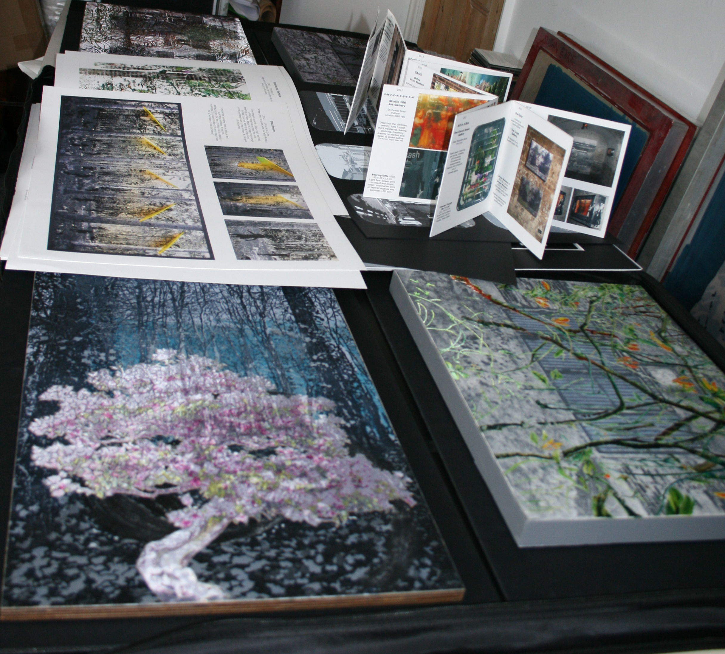
I have a new plan now – a nice deep folder with foam padding for 4 sample pieces on wood, a concertina book of exhibition photos, a small layered piece to be held up to the light and the rest as photos.

I have been struggling with my statement, trying to get the words to below 500 while making all the points I think I need to mention. I’m not sure if I have been specific or clear enough about my goals and there are things I want to mention but there isn’t room. They did say getting an interview is based on the portfolio so I must get that looking smart.

It has been good to spend some time really thinking about my practice and trying to clarify my thoughts. This was given a boost by a small group engine chat chat meeting at the Biscuit Factory. All but one were ex Goldsmiths students in need of a supportive framework for critique which is something Elizabeth Murton is very good at.

On the way there I called into Another Room and saw the evocative installation of Juliette Losq. The setting in the dilapidated Georgian property was perfect, it was like the wall had fallen away to reveal an otherworldly vista.

121121 Juliette Losq (1)

Juliette Losq

Like stepping into a dream or the sepia tinted past it was very beautiful and enigmatic.

Another favourite artist I got the chance to see was Suzanne Moxhay ‘The Aftermath’ at Bearspace.

Suzanne Moxhay

Suzanne Moxhay

This is a new series of photographic work ‘Penumbra’.

Her images have an epic quality which comes from her use of light and shadow to give drama to an unpreposessing scene but also to give away the constructed nature of the image.

Landscape becomes stage-set, the mundane becomes mystical.

Joanna Gore at Canvas and Cream had the hard task of curating a joint show of very different work.

Ashley Hanson and I were voted winners of the Canvas and Cream art prize last February at the inaugural exhibition of this new concept gallery in Forest Hill.

Susan Eyre ‘Entrance’

I was showing ‘Entrance’ in February and Ashley was showing two paintings from his City of Glass series.

For our joint show Ashley had completed his series of 8 paintings inspired by Paul Auster’s novel City of Glass from his ‘New York Trilogy’.

These are large colourful canvasses mapping the land mass and streets of New York through clues and narratives relating to the novel and Ashley’s own memories of New York.

Ashley Hanson ‘City of Glass’ series

Ashley’s interest in the relationship between fact and fiction, natural and man-made landscapes and layering techniques in his work meant we shared some common ground to build a coherent show from.
 
Joanna was drawn to my StrataGem series as she felt these pieces, considering man’s geological interference in the landscape, worked well with Ashley’s take on the geographical changes imposed by the city.

StrataGem series

The StrataGem series imagines the possibility of the formation of geological strata and beautiful gemstones created from the waste of plastic food packaging trays.

From this point we considered what other work of mine would be strong enough to hold its own against Ashley’s vibrant paintings.

I was very happy that we chose the new piece ‘Incidence’ as a complete contrast visually but still relating to the passage of time within the landscape.

Incidence

‘Incidence’ explores both a spiritual and scientific response to nature.

Reflecting on the loss of childhood it exploits a nostalgia for youthful abandon when nature was full of wonders to be discovered.

At the final hanging stage Joanna decided to include two more small pieces of mine and this really balanced the show.

Graft I and Graft II are very much about the changing landscape, the urban and the cultivated space, the hybrid landscapes and the empty in-between spaces where imagination can flourish if nothing else.

Graft II Graft I

Back in the studio I am still working on the idea of the Graft, as a process of cutting and joining using some of the other collagraphs I made as starting points for new pieces.

I am cutting and combining two prints as the background for one image – not a purist approach at all.

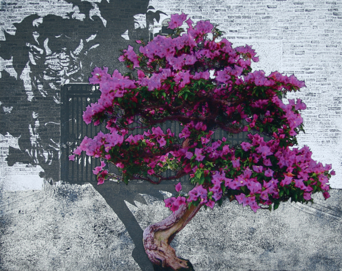
I have taken some images of bonsai trees and blown the scale up against the background so they become full-sized fantasy trees.

work in progress

I want to give these trees big shadows but as yet am not sure what medium will work best for this, maybe another collograph printed on top if that is possible once I have joined the background together.

Also I am thinking hard about my practise and its core values while I struggle with my statement for my MA application.

One of those precious autumn days of mist and damp when the sun still has a bit of warmth was spent in Camley Park before the close of Wild New Territories.

Camley Park is small, overgrown and on the canal which lends an even greater air of dankness to its earthy decay on such a day. The bright plastic coated artworks contrast strongly in the undergrowth. Outside video screens and large format prints are placed amongst the trees. The artwork explores the interplay between the urban and the wild, some of the work using a sledgehammer approach and others making beautiful and enigmatic interventions.

A favourite was ‘Howe Street meets Camley Park’ video by Kathy Kenny and Ron den Daas

Video footage of passers by is set against an urban background that morphs from reality into a painted depiction of a landscape, from fact to fiction.

Like suddenly entering a dream, stepping back in time or forward into the future, the same place in another time. Very beautifully done it was mesmerizing.

Also I was keen to see if the bull skull Gordon Cheung had installed in a bee hive had in fact been turned into a skull shaped honeycomb.

Not quite but there was lots of honeycomb around and it gave a whole new aura to a bee hive.

The last in the Odds Against Tomorrow series of exhibitions opened at Bearspace  and I went along for the private view.

Exhibit D draws together work with a dark side. I found David Lupton’s abattoir series of drawings the most disturbing.

 Detail from Abattoir 3 by David Lupton

It brings back memories of the abattoir in my childhood village that we would visit peering in through the bars to see the whites of the cattle’s eyes as they waited their turn, but it is mainly the character in the drawing.

He has a clown like face with eyes that touch something even deeper in my memory that is uncanny and unsettling.

Lupton says he is exploring horrors of reality and the innate violence of man through his work.

It is an uneasy relationship between us and our meat. Distanced from the horrors of the abattoir, the raw flesh and such evidence of death it’s almost like a parallel reality going on somewhere else.

Another pause for thought about the horrors of violence was the satire ‘The White House Murder Case’ by Jules Feiffer. When it comes down to survival, mortal or political what are we prepared to do? Where are our sensibilities?

This tension between physical and emtional disconnection and facing up to violent realities were also something that came across listening to Andrew Salgado talk about his paintings in the show The Misanthrope at Beers Lambert.

Salgado set himself the tricky task of building a show around the premise of the misanthrope – someone who hates people – and took the gay serial killer Jeffrey Dahmer as a starting point to consider his emotional response in painting such a reprehensible figure. The outcome has been an arresting set of paintings bursting with emotion built up with thick gestural blocks, drips and splashes of paint.

It was also interesting to see how his painting has evolved since the first Surface show at The Crypt in 2011.

So my thoughts have been directed around facing up to those darker sensibilities of violence which emanate from something close to nature but also to the new relationships that evolve within our urban environment.

I was delighted to hear the founder of The Roundabout Appreciation Society talk on radio 4 about his love of the roundabout which he described as ‘an Oasis in a sea of asphalt’.

In my directory of folders sits one called Roundabout with lots of images like this

all waiting to be incorporated into a series of work called Oasis. I should maybe get in touch with the association – he said they lacked women members.

In the meantime I have finished the second Graft piece looking at ideas of transplanting, cutting and inserting something appealing onto a base or unappealing substrate.

A hybrid plant in a hybrid landscape. The rhododendron image is revealed by cutting into the background image with a soldering iron incising the polyester to reveal layers underneath.

I was interested to read in the local paper that the rhododendron ponticum a non-native variety introduced by the Victorians to the Isabella Plantation in Richmond Park is being removed as it is causing a risk of disease.

And so the landscape changes.